
A Receiver Operating Characteristic (ROC) curve is a graphical representation used to assess the performance of a binary classification model, such as logistic regression, support vector machines, or decision trees. It illustrates the trade-off between a model’s ability to correctly classify true positive instances and its tendency to incorrectly classify false positive instances as you vary the model’s classification threshold.
The ROC curve is created by plotting the True Positive Rate (TPR) against the False Positive Rate (FPR) at various threshold settings. Here are some key terms related to ROC curves:
- True Positive Rate (TPR), Sensitivity, or Recall: This is the proportion of actual positive cases that the model correctly predicts as positive. It is calculated as:TPR = True Positives / (True Positives + False Negatives)In the context of a medical test, TPR is the percentage of people with the disease who test positive.
- False Positive Rate (FPR): This is the proportion of actual negative cases that the model incorrectly predicts as positive. It is calculated as:FPR = False Positives / (False Positives + True Negatives). FPR is the percentage of healthy individuals who test positive in a medical test.
- Threshold: A threshold is a value that the model uses to determine whether a given instance should be classified as positive or negative. Adjusting this threshold allows you to control the balance between TPR and FPR.
Step 1: Install and Load Required Packages
If you haven’t already installed the ROCR package, you can do so using the install.packages function:
install.packages("ROCR") After installation, load the package:
library(ROCR)
Step 2: Prepare the Data
I will use a hypothetical dataset and a simple logistic regression model for this example. You can replace this with your own data and model.
# Load sample data
data(ROCR.simple)

# Extract true class labels and predicted probabilities
predictions <- ROCR.simple$predictions
labels <- ROCR.simple$labels
Here, predictions are the predicted probabilities (scores) for the positive class, and labels are the true binary labels (0 or 1).
Step 3: Create a Prediction Object
To create a prediction object that ROCR can work with, use the prediction function:
pred <- prediction(predictions, labels)
Step 4: Calculate ROC Curve Data
Use the performance function to calculate the ROC curve data:
roc <- performance(pred, "tpr", "fpr")
Step 5: Plot the ROC Curve
You can now create and customize the ROC curve plot using the plot function:
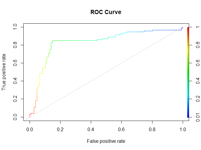
plot(roc, main="ROC Curve", colorize=TRUE, print.auc=TRUE)
abline(a=0, b=1, lty=2, col="gray")
mainsets the title of the plot.colorizeadds color to the plot.print.aucdisplays the AUC (Area Under the Curve) on the plot.ablineadds a dashed reference line representing a random classifier.
Step 6: Save the Plot (Optional)
If you want to save the plot to a file, you can use the pdf, png, or other plotting functions:
pdf("ROC_curve.pdf")
plot(roc, main="ROC Curve", colorize=TRUE, print.auc=TRUE)
abline(a=0, b=1, lty=2, col="gray")
dev.off()
This code saves the ROC curve to a PDF file.
Your ROC curve plot should now be displayed on the screen (or saved as a file if you opted to do so). As you change the classification threshold, the curve will show the trade-off between true positive rate (sensitivity) and false positive rate (1 – specificity).