Introduction to ROC curves
A ROC curve is a graphical representation of the performance of a binary classifier. The curve is created by plotting the true positive rate (TPR) against the false positive rate (FPR) at various threshold values. The term “binary classifier” is basically a way of saying logistic regression.
Logistic regression is a statistical technique used to predict the probability of an event occurring. It is used when the dependent variable is binary, or dichotomous, which means it can only take two values, such as 1 and 0.
Logistic regression can be a very good fit for a dataset, depending on the data. The most important thing to consider when determining how well a logistic regression fits a dataset is the percentage of correctly classified observations. This can be measured using a variety of metrics, such as accuracy, precision, and recall.
Accuracy is the proportion of all observations that are correctly classified. This is the most basic metric and is simply the number of correct predictions divided by the total number of predictions.
Precision is a measure of how many of the observations that were predicted to be positive are actually positive. This is important to consider because you may want to know how many of the positive predictions are actually correct.
Recall is a measure of how many of the positive observations were correctly classified. This is important to consider because you may want to know how many of the positive observations were actually classified as positive.
These three metrics can be used to get a general idea of how well a logistic regression fits a dataset. However, it is important to keep in mind that each dataset is different, and one metric may be more important than another depending on the data.
Plotting ROC curves in Python
Step 1: Import libraries
Why do we need to import libraries? Libraries help in python by providing a wide range of functionality that can be used by programmers in their code. This functionality can range from simple tasks such as string manipulation to more complex tasks such as machine learning. Libraries also provide a way for programmers to share their code with others, which can help to improve the overall quality of the codebase.
Here are the libraries we are going to use;
import pandas as pd
import numpy as np
from sklearn.model_selection import train_test_split
from sklearn.linear_model import LogisticRegression
from sklearn import metrics
import matplotlib.pyplot as plt
If you haven’t installed the following libraries, you can do that by simply using pip. Pip is a package management system used to install and manage software packages written in Python. Many packages can be found in the Python Package Index (PyPI). Pip allows you to install packages from PyPI, version control, local projects, and directly from distribution files.
pip install pandas numpy sklearn
When using the pip install command to install several Python packages, the packages may be listed in line with each other as long as spaces are used to separate them.
Step 2: Fitting Logistic Regression Model.
We’ll be working with a diabetes data set to fit a logistic regression model. Download the data set here.
The diabetes data set is a set of medical records that includes information on patients’ diabetes status, age, sex, and other characteristics. The data set can be used to build a logistic regression model to predict the probability of patient developing diabetes.
data = pd.read_csv('diabetes-dataset.csv')

# define the explanatory variables and response variable
X = data[['Age','Insulin', 'DiabetesPedigreeFunction']]
Y = data['Outcome']

# Split the dataset into training (70%) and testing (30%) sets.
X_train, X_test, Y_train, Y_test = train_test_split(X,Y, test_size=0.3, random_state=0)

log_regression = LogisticRegression()

#fit the model using the training data
log_regression.fit(X_train, Y_train)
Step 3: Plot the ROC curve
#Plot the ROC curve
#define metrics
y_pred_proba = log_regression.predict_proba(X_test)[::,1]
fpr, tpr, _ = metrics.roc_curve(Y_test,  y_pred_proba)

#create ROC curve
plt.plot(fpr,tpr)
plt.ylabel('True Positive Rate')
plt.xlabel('False Positive Rate')
plt.show() Output:
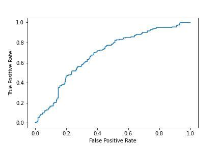
This plot shows the true positive rate (TPR) on the y-axis against the false positive rate (FPR) on the x-axis, for all possible classification thresholds. The higher the TPR and the lower the FPR, the better the model.
Step 3. Plot the AUC curve
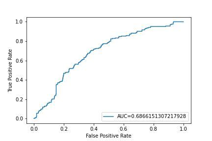
AUC is the percentage of the ROC plot that is underneath the curve. AUC provides a single measure of the quality of the classification. The AUC curve is plotted by first computing the AUC for different values of the threshold and then plotting the AUC value against the threshold. AUC can be computed for both binary and multi-class classification. In our case, we’re working on binary classification.
#define metrics
y_pred_proba = log_regression.predict_proba(X_test)[::,1]Ad
fpr, tpr, _ = metrics.roc_curve(Y_test,  y_pred_proba)
auc = metrics.roc_auc_score(Y_test, y_pred_proba)

#create ROC curve
plt.plot(fpr,tpr,label="AUC="+str(auc))
plt.ylabel('True Positive Rate')
plt.xlabel('False Positive Rate')
plt.legend(loc=4)
plt.show()
Output:
Advantages and Disadvantages of ROC Curves.
There are several advantages to using a ROC curve to measure performance. First, it is a relatively simple and straightforward way to evaluate a binary classification model. Second, the ROC curve provides a clear visual representation of the model’s performance, which can be helpful in understanding how the model is performing.
A ROC curve is a useful tool for measuring the performance of a classification model because it allows you to visualize the model’s trade-off between true positive and false positive rates. The closer the curve is to the top-left corner of the plot, the better the model is at distinguishing between positive and negative examples. The AUC can be used to compare the performance of different models.
Finally, the ROC curve is a useful tool for comparing the performance of different binary classification models.
There are also some disadvantages to using a ROC curve to measure performance. First, the ROC curve is only a helpful tool if there is a large enough data set to create a reliable curve. Second, the ROC curve is only a measure of performance for binary classification models; it cannot be used to evaluate the performance of models that predict more than two classes. Finally, the interpretation of the ROC curve can be difficult, and it is often necessary to consult with a statistician or data scientist in order to properly interpret the results.
Ways to improve the performance of a ROC curve-based algorithm.
There are a few ways to improve the performance of a ROC curve-based algorithm. One way is to increase the number of positive and negative examples used to train the classifier. This will provide the classifier with more data to learn from, and hopefully result in a more accurate model. Another way to improve performance is to carefully select features that are likely to be predictive of the target class. This can be done through feature selection methods such as mutual information or chi-squared tests. Finally, it is important to tune the parameters of the classifier to find the optimal values for the data. This can be done using grid search or other similar methods.