
Definition
A spinogram is a graph that shows the relationship between two variables, with one variable plotted on the x-axis and the other plotted on the y-axis. It can show how changes in one variable affect the other. For example, it can be used to show how changes in the price of a good affect the quantity of the demanded good.
A spineplot is a graph that shows the relationship between two variables, with one variable plotted on the x-axis and the other plotted on the y-axis. It can show how changes in one variable affect the other.
Importance of Spineplots and Spinegrams in R
Spineplots and spinegrams are two useful visualization tools in R programming that allow users to examine the distribution of categorical data. These tools are important because they help users to quickly identify patterns and anomalies in large datasets, making it easier to make decisions or draw conclusions.
A spineplot is a graph that displays the distribution of categorical data by stacking boxes or bars on top of each other. Each box or bar represents a category, and the height or width of the box or bar indicates the number of observations that fall into that category. The boxes or bars are arranged in order of increasing frequency, with the most common category at the bottom or left and the least common category at the top or right. This arrangement allows users to quickly identify which categories are most common and which are least common, and to see if there are any unusual patterns or outliers in the data.
A spinegram, on the other hand, is a variation of a spineplot that displays the distribution of categorical data by arranging the boxes or bars in a diagonal pattern. The diagonal arrangement allows users to see patterns and relationships between categories that might not be obvious in a traditional spineplot. For example, if there are two categories that are highly correlated, they will appear as a diagonal line in the spinegram.
Both spineplots and spinegrams are easy to create in R programming using the base graphics or ggplot2 package. They are particularly useful for exploring the distribution of categorical data, such as survey responses or demographic data, and can be used to identify patterns or anomalies that might be missed with other visualization tools. They are also useful for comparing the distribution of categorical data across different groups or subgroups, making it easier to identify differences or similarities between them.
In summary, spineplots and spinegrams are important visualization tools in R programming because they allow users to quickly identify patterns and anomalies in large datasets containing categorical data. They are easy to create and can be used to explore the distribution of data across different groups or subgroups, making it easier to identify differences or similarities between them.
Spineplots and spinegrams are graphical representations of contingency tables that display the marginal distributions of two categorical variables. Here’s an example code for generating spineplots and spinegrams in R using the built-in “mtcars” dataset:
# Load the mtcars dataset
data(mtcars)

# Create a contingency table of transmission type and number of gears
table1 <- table(mtcars$am, mtcars$gear)

# Install and load the "vcd" package for generating spineplots and spinegrams
install.packages("vcd")
library(vcd)

# Generate a spineplot of the contingency table
spineplot(table1, main="Transmission Type vs. Number of Gears", xlab="Number of Gears", ylab="Transmission Type")

# Generate a spinegram of the contingency table
spinegram(table1, main="Transmission Type vs. Number of Gears", xlab="Number of Gears", ylab="Transmission Type")
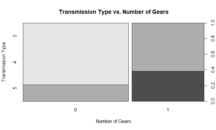
In the above code, we first load the “mtcars” dataset, which contains information on various car models, including the transmission type and the number of gears. We then create a contingency table of transmission type and the number of gears using the table() function.
Next, we install and load the “vcd” package, which provides functions for generating spineplots and spinegrams. We then use the spineplot() function to generate a spineplot of the contingency table and the spinegram() function to generate a spinegram.
The resulting plots show the distribution of transmission types and the number of gears.
Color Customization
Color customization is an essential aspect of data visualization that allows users to highlight specific patterns or trends in the data. In R, there are several ways to customize the colors used in spineplots and spinegrams.
To begin with, we can use the color argument in the spineplot() function to specify the color scheme for the plot. The color argument accepts a vector of color names or codes that will be used to color each category in the plot. For example:
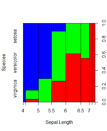
# Load the iris dataset
data(iris)


# Create a spinegram with customized colors
spineplot(Species ~ Sepal.Length, data = iris,
          col = c("red", "green", "blue"))
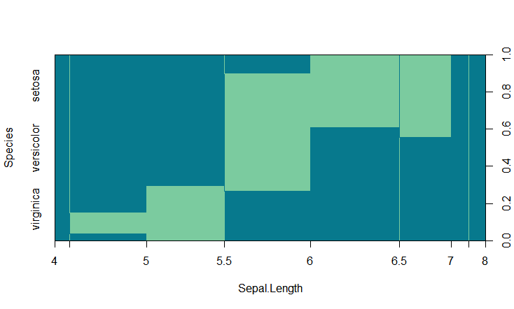
In addition to the col Parameters, spineplots, and spinegrams have other parameters that can be used to customize their appearances, such as main (to add a main title), xlab (to add a label for the x-axis), ylab (to add a label for the y-axis), and border (to set the color of the borders of the bars or spines). By customizing these parameters, you can create plots tailored to your specific needs and make it easier to convey your message.
spineplot(Species ~ Sepal.Length, data = iris, col = c("#07798D", "#7BCB9F"),
          border = c("#07798D", "#7BCB9F"))
Conclusion
Overall, spineplots and spinegrams are valuable tools for exploratory data analysis and communicating insights about categorical data to others. By leveraging these powerful graphical techniques in R, analysts and researchers can gain deeper insights into the patterns and relationships in their data and use that knowledge to make better decisions and drive better outcomes.