Introduction
A strip chart, also known as a strip plot or one-dimensional scatter plot, is a useful visualization tool to explore the distribution of a single continuous variable. In this tutorial, we will walk you through the process of creating a strip chart in R, a powerful programming language for statistical computing and graphics.
Step 1: Install and Load Required Packages
Before we begin, ensure that you have R and RStudio installed on your system. To create a strip chart, we will need the ggplot2 package, which provides an easy-to-use framework for creating visually appealing plots. If you haven’t installed ggplot2 yet, use the following command to install it:
install.packages("ggplot2")
Once installed, load the package into your R session:
library(ggplot2)
Step 2: Prepare the Data
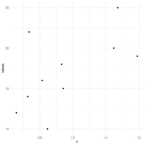
To illustrate the creation of a strip chart, let’s assume we have a dataset named mydata with a single variable named values. Ensure your dataset is loaded into R, or create a sample dataset as follows:
mydata <- data.frame(values = c(10, 15, 20, 12, 18, 22, 16, 25, 14, 19))
Step 3: Create the Strip Chart
Now that we have our dataset ready, we can create a strip chart using ggplot2. The basic syntax for creating a strip chart is as follows:
ggplot(data = mydata, aes(x = 1, y = values)) +
  geom_jitter(width = 0.2, height = 0) +
  theme_minimal()
Let’s break down the code:
ggplot(data = mydata, aes(x = 1, y = values)): We specify the dataset and the mapping aesthetics. In this case,x = 1assigns a constant value to the x-axis, whiley = valuesmaps thevaluesvariable to the y-axis.geom_jitter(width = 0.2, height = 0): This function adds jitter to the data points, preventing overlapping points. Adjust thewidthparameter to control the spread of the points horizontally.theme_minimal(): This function applies a minimalistic theme to the plot, removing unnecessary decorations.

Step 4: Customize the Strip Chart
The basic strip chart is ready, but we can further customize it to enhance readability and aesthetics. Here are some common customization options:
- Axis Labels: To add labels to the x and y axes, use the
xlab()andylab()functions, respectively. - Title: You can add a title to the plot using the
ggtitle()function. - Color and Shape: Modify the appearance of the data points using the
colorandshapeaesthetics within thegeom_jitter()function. - Background Theme: You can choose from a variety of themes provided by
ggplot2using thetheme()function.
Step 5: Save and Export the Strip Chart
Once you are satisfied with the appearance of your strip chart, you may want to save it as an image file for further use or sharing. To save the plot, use the ggsave() function:
ggsave("strip_chart.png", plot = last_plot(), dpi = 300)
This command will save the strip chart as a PNG image file named “strip_chart.png” in the current working directory. Adjust the file name and format according to your requirements.
Here’s an in-depth code example:
# Step 1: Load the ggplot2 package
library(ggplot2)

# Step 2: Load the mtcars dataset
data(mtcars)

# Step 3: Create the strip chart
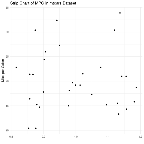
ggplot(data = mtcars, aes(x = 1, y = mpg)) +
  geom_jitter(width = 0.2, height = 0) +
  theme_minimal() +
  labs(x = "", y = "Miles per Gallon") +
  ggtitle("Strip Chart of MPG in mtcars Dataset")

Let’s break down the code:
- We begin by loading the
ggplot2package, which provides the necessary functions for creating the strip chart. - Next, we load the “mtcars” dataset using the
data()function. This ensures that the dataset is available for use in our code. - We create the strip chart using the
ggplot()function. Inside the function, we specify the dataset asmtcarsand map the x-axis to a constant value of 1 (usingx = 1) and the y-axis to the “mpg” variable (usingy = mpg). - To prevent overlapping points, we add jitter to the data points using the
geom_jitter()function. Thewidthparameter controls the horizontal spread of the points, and in this example, it is set to 0.2. - We apply a minimalistic theme to the plot using the
theme_minimal()function to remove unnecessary decorations and keep the focus on the data. - To improve the readability of the plot, we add x-axis and y-axis labels using the
labs()function. In this case, we provide an empty string""for the x-axis label and “Miles per Gallon” for the y-axis label. - Finally, we add a title to the plot using the
ggtitle()function. The title “Strip Chart of MPG in mtcars Dataset” summarizes the content of the chart.
Conclusion:
By following the step-by-step process, you can effectively visualize the distribution of a continuous variable in a clear and concise manner.
Remember, customizing your strip chart is an excellent way to tailor it to your specific needs. Explore the available options to add labels, titles, and modify colors and shapes to make your strip chart more informative and visually appealing.
With the ability to save your strip chart as an image file, you can easily share it with others or use it in reports, presentations, or publications. Experiment with different file formats and resolutions to ensure the best quality output.
R and ggplot2 provide a powerful platform for creating a wide range of visualizations, including strip charts. By mastering this technique, you can effectively explore and communicate patterns and distributions within your data.
Remember to practice and explore further, as there are many other advanced techniques and plot types available in R that can help you uncover deeper insights from your data.
