Introduction
A correlation heatmap is a valuable visualization tool that allows us to identify relationships and patterns within a dataset. In this blog post, we will walk through the process of creating a correlation heatmap using R. By the end of this tutorial, you will have a solid understanding of the steps involved and be able to generate informative correlation heatmaps for your own data.
Step 1: Install and load required packages
To get started, we need to install and load the necessary R packages. We will be using the corrplot and ggplot2 packages for creating and customizing the heatmap. If you haven’t installed these packages yet, use the following code to install them:
install.packages("corrplot")
install.packages("ggplot2")
Step 2: Prepare the data
For this example, let’s assume we have a dataset named mydata containing numerical variables. Make sure to replace mydata with the name of your actual dataset in the code below. We will use the built-in mtcars dataset as an example:
mydata <- mtcars
Step 3: Calculate the correlation matrix
Next, we need to calculate the correlation matrix for our dataset. The cor() function in R calculates the correlation coefficients between variables. We can use this function on our dataset to obtain the correlation matrix:
cor_matrix <- cor(mydata)
Step 4: Customize the correlation heatmap
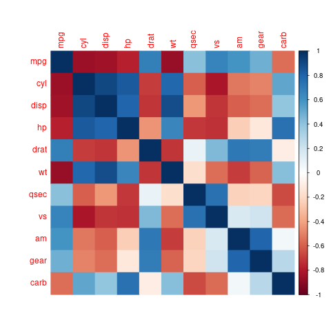
To create the correlation heatmap, we will use the corrplot() function from the corrplot package. This function provides numerous customization options to tailor the appearance of the heatmap according to our preferences. Here’s an example code snippet to create a basic correlation heatmap:
corrplot(cor_matrix, method = "color")
The method parameter specifies the coloring method for the heatmap. Other options include “circle” and “number”. Feel free to experiment with different methods to find the one that suits your needs best.
Step 5: Add additional customization
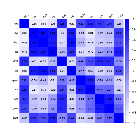
To enhance the readability and visual appeal of our correlation heatmap, we can further customize it using functions from the ggplot2 package. Here’s an example code snippet that demonstrates a few common customization options:
corrplot(cor_matrix, method = "color", tl.col = "black", tl.srt = 45,
         addCoef.col = "black", number.cex = 0.7,
         tl.cex = 0.8, col = colorRampPalette(c("white", "blue"))(100))
This code snippet sets the color of the text labels (tl.col), rotates the text labels by 45 degrees (tl.srt), adjusts the size of the correlation coefficients (number.cex), scales the size of the text labels (tl.cex), and applies a custom color palette to the heatmap (col).
Conclusion
Creating a correlation heatmap in R is a straightforward process that involves calculating the correlation matrix and visualizing it using the corrplot function. By customizing the heatmap with additional options from the ggplot2 package, we can create informative and visually appealing visualizations. With this guide, you now have the knowledge to create your own correlation heatmaps in R and gain valuable insights from your data.
Remember to adapt the code to your specific dataset and requirements, and don’t hesitate to explore further customization options and advanced techniques as you become more familiar with creating correlation heatmaps in R. Correlation heatmaps are versatile tools that can be applied to various fields, such as finance, biology, and social sciences, to explore relationships between variables and uncover hidden patterns.
We hope this step-by-step guide has helped you understand the process of creating a correlation heatmap in R. Remember to install and load the required packages, prepare your data, calculate the correlation matrix, and customize the heatmap to suit your needs. By experimenting with different options and exploring advanced techniques, you can create visually appealing and informative correlation heatmaps for your own datasets.
Keep in mind that creating a correlation heatmap is just the beginning. It’s essential to interpret the heatmap correctly and dive deeper into the relationships between variables. Correlation does not imply causation, so it’s crucial to consider other factors and conduct further analysis to draw meaningful conclusions from your data.
R is a powerful and flexible programming language for data analysis and visualization. Mastering the creation of correlation heatmaps is just one of the many skills you can develop in R to gain insights from your data. We encourage you to explore other visualization techniques, statistical methods, and machine learning algorithms available in R to expand your analytical toolbox.