Calculating and visualizing quartiles in R is a fundamental task when working with data, especially for exploring the distribution and spread of your data. Quartiles divide a dataset into four equal parts, and they are often used in statistics to understand the central tendency and the spread of the data.
Quartiles are statistical measures that divide a dataset into four equal parts, with each part representing 25% of the data. Quartiles are used to describe the distribution and spread of a dataset. There are three quartiles in a dataset: the first quartile (Q1), the second quartile (Q2), and the third quartile (Q3).
- Q1 (First Quartile): Q1 is also known as the lower quartile, representing the 25th percentile of the data. This means that 25% of the data points fall below Q1. The value below lies where the lowest 25% of the data points lie.
- Q2 (Second Quartile): Q2 is the median of the dataset, representing the 50th percentile. Half of the data points are below Q2, and half are above it. It is the middle value in a sorted dataset.
- Q3 (Third Quartile): Q3 is also known as the upper quartile, representing the 75th percentile of the data. This means that 75% of the data points fall below Q3. The value below lies the lowest 75% of the data points.
Calculating Quartiles in R
First, let’s create a sample dataset and calculate the quartiles. We will use the quantile() function in R to do this. Suppose we have a dataset named data:
# Create a sample dataset
data <- c(12, 23, 34, 45, 56, 67, 78, 89, 90, 100)
Quartiles Calculation
To calculate quartiles (Q1, Q2, and Q3), you can use the quantile() function. Q1 represents the 25th percentile, Q2 is the median (50th percentile), and Q3 is the 75th percentile.
# Calculate quartiles
q1 <- quantile(data, 0.25)
median <- quantile(data, 0.5)
q3 <- quantile(data, 0.75)

cat("Q1 (25th Percentile):", q1, "\n")
cat("Median (50th Percentile):", median, "\n")
cat("Q3 (75th Percentile):", q3, "\n")
Visualizing Quartiles in R
Visualizing quartiles can help you gain a better understanding of the data distribution. We can use boxplots to visualize quartiles effectively. Here’s how you can create a boxplot in R:
Boxplot Creation
# Create a boxplot
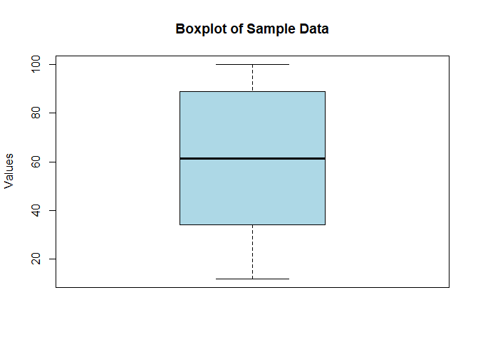
boxplot(data, main="Boxplot of Sample Data", ylab="Values", col="lightblue")

The boxplot() function takes the dataset data as input and produces a boxplot. The boxplot provides a visual representation of the quartiles. It shows the median (Q2) as a line inside the box, and the box represents the interquartile range (IQR), which includes Q1 and Q3. Any data points beyond the whiskers of the boxplot are considered outliers.
Customizing the Boxplot
You can further customize the boxplot to enhance its visual representation. For example, you can add labels and change the colour:
# Customize the boxplot
boxplot(data, main="Boxplot of Sample Data", ylab="Values", col="lightblue",
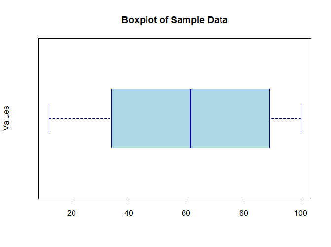
        border="darkblue", names="Sample Data", horizontal=TRUE)

This code adds labels, changes the border and fill colors, and creates a horizontal boxplot for better readability.
Quartiles are particularly useful in understanding data spread and identifying potential outliers. They are often used in boxplots, which visually represent the quartiles and help assess the central tendency and variability in a dataset. Additionally, quartiles are important in various statistical analyses and are used in conjunction with the interquartile range (IQR) to detect and handle outliers.
Example 2
First, let’s load the “mtcars” dataset and calculate the quartiles for a specific variable, such as miles per gallon (mpg).
# Load the mtcars dataset
data(mtcars)

# Calculate quartiles for the 'mpg' variable
q1 <- quantile(mtcars$mpg, 0.25)
median <- quantile(mtcars$mpg, 0.5)
q3 <- quantile(mtcars$mpg, 0.75)

cat("Q1 (25th Percentile):", q1, "\n")
cat("Median (50th Percentile):", median, "\n")
cat("Q3 (75th Percentile):", q3, "\n")
In this code, we’ve loaded the “mtcars” dataset and calculated quartiles for the “mpg” variable, which represents miles per gallon.
Visualizing Quartiles in R
Now, let’s create a boxplot to visualize the quartiles for the “mpg” variable.
# Create a boxplot for the 'mpg' variable
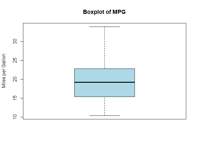
boxplot(mtcars$mpg, main="Boxplot of MPG", ylab="Miles per Gallon", col="lightblue")

The boxplot() function is used to create a boxplot for the “mpg” variable, and it will display the quartiles visually.
You can customize the boxplot further, just as in the previous example, by changing colors, adding labels, or modifying the appearance to suit your needs.
Customized Boxplot
Here’s an example of a customized boxplot:
# Customized boxplot for the 'mpg' variable
boxplot(mtcars$mpg, main="Boxplot of MPG", ylab="Miles per Gallon", col="lightblue",
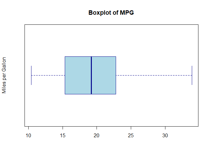
        border="darkblue", names="MPG Data", horizontal=TRUE)

This code adds customization options, such as changing border and fill colors, adding labels, and creating a horizontal boxplot.
