In this article we’ll be looking at how to plot an Xbar and R chart using R programming. But before we do that, let us first understand the concept behind it. If you are familiar with the concept, you can just skip ahead and look at an example below.
Definition
An xbar chart is a graphical representation of the average value of a data set over a period of time. The x-axis of the chart represents time, and the y-axis represents the average value.
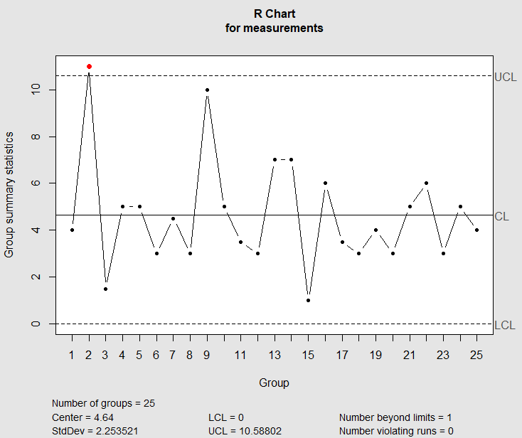
An R chart is a type of statistical chart used to monitor the quality of data over time. It is used to track the variation in the data and to identify any outlying data points.
Variables and Attributes
It is important to understand the difference between the two.
Quality characteristics fall into two broad classes
- Variables
- Attributes
Characteristics that are measurable and are expressed on a numerical scale are called variables like length, width, height, diameter, volume etc.
A quality characteristic that cannot be measured on a numerical scale is referred to as an attribute e.g performance, realibilty, appearance, availabilty, safety, usability etc
Control Charts for Variables
Control charts for variables are powerful tools that can be used when measurements from a process are available. Variable charts explain process data in terms of both spread (piece-to-piece varianility) and location (process average)
Control charts for variables are prepared from quantitative data e.g diameter, weight, height etc.
Note that control charts for variables are preapred and analyzed in pairs i.e locaion and spread.
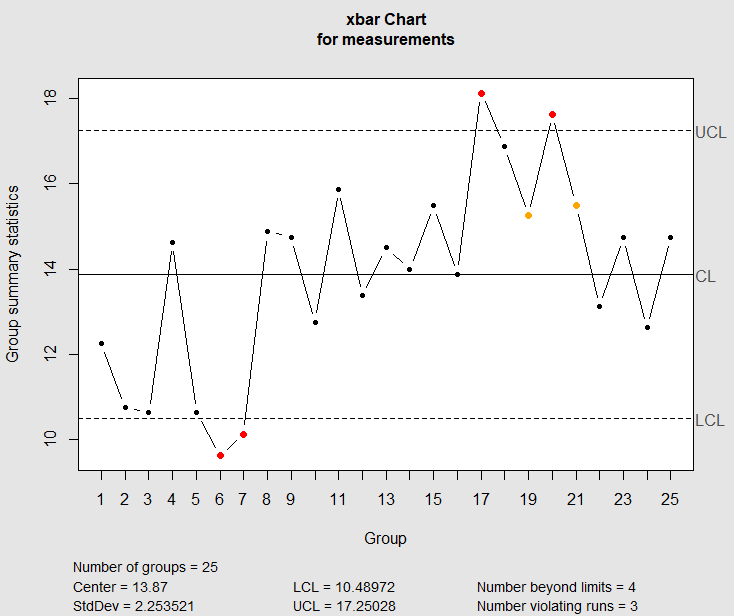
The most commonly used pair of control charts; x-bar chart and R chart.
The X-bar is the average of the values in small sub-groups, and R is the range of values within each sub-group, and the R chart is the range of values within each sub-group.
Control limits for R charts
UCL_R=D_4\overline{R}and
LCL_R=D_3\overline{R}where
D_3=1-\frac{3d_3}{d_2} D_4=1+\frac{3d_3}{d_2}where
d_2=\int_{-\infty}^{\infty}\left[1-\left(1-\alpha\right)^n\right]dx_land
d_3=2\int_{-\infty}^{\infty}\int_{-\infty}^{x_l}\left(1-\alpha_l^n-\left(1-\alpha_n\right)^n+\left(\alpha_l-\alpha_n\right)^n\right)and
\alpha_l=\frac{1}{\sqrt{2\pi}}\int_{-\infty}^{x_l}e^{-\left(\frac{x^2}{2}\right)}dxand
\alpha_n=\frac{1}{\sqrt{2\pi}}\int_{-\infty}^{x_n}e^{-\left(\frac{x^2}{2}\right)}dxn is the sample size
\overline{R} is the mean of the range of values in each subgroup.
Control limits for X-bar Chart
UCL=\overline{\overline{R}}+A_2\overline{R}and
LCL=\overline{\overline{X}}-A_2\overline{R}where
A_2=\frac{3}{d_2\left(\sqrt{n}\right)}[lat1ex] A_2,\ D_3\ and\ D_4 [/latex] are factors that depend on subgroup size.
A_2 is the factor for controlling for averages and D_2\ and\ D_4 are the factors for controlling for ranges.
Table of Constants
| n | A2 | D3 | D4 |
| 2 | 1.880 | 0 | 3.267 |
| 3 | 1.023 | 0 | 2.575 |
| 4 | 0.729 | 0 | 2.282 |
| 5 | 0.577 | 0 | 2.114 |
| 6 | 0.483 | 0 | 2.004 |
| 7 | 0.419 | 0.076 | 1.924 |
| 8 | 0.373 | 0.136 | 1.864 |
| 9 | 0.337 | 0.184 | 1.816 |
| 10 | 0.308 | 0.223 | 1.777 |
Example
| Subgroup | 1 | 2 | 3 | 4 | mean(x) | R |
| 1 | 14 | 10 | 12 | 13 | 12.25 | 4 |
| 2 | 14 | 4 | 15 | 10 | 12.75 | 5 |
| 3 | 10 | 11 | 10 | 11.5 | 10.63 | 1.5 |
| 4 | 12 | 15 | 17 | 14.5 | 14.63 | 5 |
| 5 | 13 | 8 | 10 | 11.5 | 10.63 | 5 |
| 6 | 8 | 10.5 | 9 | 11 | 9.63 | 2 |
| 7 | 11 | 12.5 | 9 | 8 | 10.13 | 4.5 |
| 8 | 16 | 15.5 | 13 | 15 | 14.88 | 2.5 |
| 9 | 16 | 13 | 10 | 20 | 14.75 | 10 |
| 10 | 10 | 11 | 15 | 15 | 12.75 | 5 |
| 11 | 18 | 15 | 14.5 | 16 | 15.88 | 3.5 |
| 12 | 15 | 13 | 13.5 | 12 | 13.38 | 3 |
| 13 | 14 | 19 | 13 | 12 | 14.50 | 7 |
| 14 | 16 | 18 | 11 | 11 | 14.00 | 7 |
| 15 | 16 | 16 | 15 | 15 | 15.50 | 1 |
| 16 | 16 | 15.5 | 10 | 14 | 13.88 | 6 |
| 17 | 16.5 | 18 | 18 | 20 | 18.13 | 3.5 |
| 18 | 15 | 18 | 18 | 16.5 | 16.88 | 3 |
| 19 | 13 | 16 | 17 | 15 | 15.25 | 4 |
| 20 | 16 | 18 | 17.5 | 19 | 17.63 | 3 |
| 21 | 18 | 17 | 13 | 14 | 15.50 | 5 |
| 22 | 16 | 10.5 | 10 | 16 | 13.13 | 6 |
| 23 | 15 | 16 | 15 | 13 | 14.75 | 3 |
| 24 | 11.5 | 14 | 15 | 10 | 12.63 | 5 |
| 25 | 16 | 12 | 15 | 16 | 14.75 | 4 |
Limits for R chart
UCL_R=D_4\cdot\overline{R}= 2.28 * 4.34
= 9.9
LCL_R=D_3\cdot\overline{R}= 0*4.34
= 0
Limits for X-bar Chart
UCL=\overline{\overline{x}}+A_2\cdot\overline{R}= 13.96+0.73*4.34
= 17.1
LCL=\overline{x}-A_2\cdot\overline{R}= 13.96-0.73*4.34
= 10.8
Plotting the above data for X-bar and R chart in R
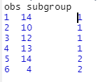
Note that if you were to do data entry for the data presented above. You’ll need to input it in this format
library(qcc)

charts.data <- read.csv("SQC.csv")
charts.data
attach(charts.data)

#To view the last six datasets
tail(charts.data)
obs subgroup
95   15       24
96   10       24
97   16       25
98   12       25
99   15       25
100  16       25


#creating a qcc object from the data
measurements <- qcc.groups(obs,subgroup)
head(measurements)
[,1] [,2] [,3] [,4]
1   14 10.0   12 13.0
2   14  4.0   15 10.0
3   10 11.0   10 11.5
4   12 15.0   17 14.5
5   13  8.0   10 11.5
6    8 10.5    9 11.0

tail(measurements)
[,1] [,2] [,3] [,4]
20 16.0 18.0 17.5   19
21 18.0 17.0 13.0   14
22 16.0 10.5 10.0   16
23 15.0 16.0 15.0   13
24 11.5 14.0 15.0   10
25 16.0 12.0 15.0   16

#summary of the data
summary(measurements)
V1              V2              V3              V4
Min.   : 8.00   Min.   : 4.00   Min.   : 9.00   Min.   : 8.00
1st Qu.:13.00   1st Qu.:11.00   1st Qu.:10.00   1st Qu.:11.50
Median :15.00   Median :15.00   Median :13.50   Median :14.00
Mean   :14.24   Mean   :13.86   Mean   :13.42   Mean   :13.96
3rd Qu.:16.00   3rd Qu.:16.00   3rd Qu.:15.00   3rd Qu.:16.00
Max.   :18.00   Max.   :19.00   Max.   :18.00   Max.   :20.00
#R charts
qcc(measurements,type="R")
#X-bar chart
qcc(measurements,type="xbar")